Can someone give me a brief explanation of how to read this processor graph?
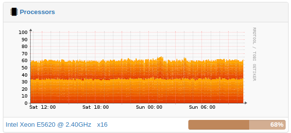
Can someone give me a brief explanation of how to read this processor graph?
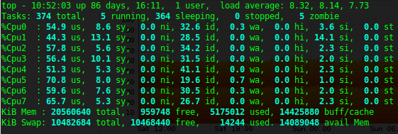
To clarify, what is the second dark line about? This is the CPU usage reported by top.
All 16 processors are graphed “stacked” on the same. The color definition list is not containing 16 colors so it loops. That’s why you see the same colors coming back.
If you click the graph, you get it larger, and you can see the legend explaining the colors.
Ok so where top shows 50% usage per cpu that gets measured against the totally accumulation of CPU resources and becomes a much smaller number. And the fact that the work load is so perfectly shared between cpus is just showing the exceptional load sharing algorithm?
LibreNMS asks the snmpd daemon on the device. So the values themselves are not “calculated” or “changed” by LibreNMS. You need to investigate the meaning of the values on the source side, ie snmpd.