Hi all.
Has anyone come across this on the Availability-Map dashboard?
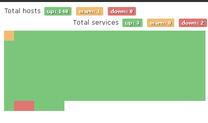
I’ve tried changing the sizes to see if I can change its sizes, but it doesn’t seem to make much of a difference. They are all squished together.
Thanks!
P
Hi all.
Has anyone come across this on the Availability-Map dashboard?
I’ve tried changing the sizes to see if I can change its sizes, but it doesn’t seem to make much of a difference. They are all squished together.
Thanks!
P
monteroman,
Looks like you change the availability map settings in the Web UI under Global Settings -> WebUI Settings -> Availability map settings.
This will happen when you turn on “Availability map compact view”
Ahhh… thank you! That fixes it for me.
Is there a way to get it to sort so the warning’s and downs are at the top of the list?
I had the “Sort device by status” set to Yes, but it seems that the down items are at the bottom.
Give it a second to refresh
Is there any specific reason why the alert sort won’t put the DOWN’s at the top, then put the Warnings 2nd, then the UP’s last?
Should I put in a feature request for this?
That’s a good question… When you Enable sort by status did give it at least 5-10 min to refresh the map?
Kevin,
Yeah, I have waited about 20 minutes and it is showing at the bottom of my list. These are Nagios services by the way - might that by why?
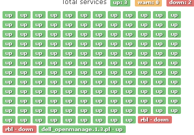
Incidently, I’m trying to get the Nagios RBL checker to not show down when it comes back as OK when I run it manually, but that’s another problem. ![]()
Yeah, mine shows the same way fo Nagios services… I guess you can throw a post in a feature request to see about possibly getting that changed, Unless know coding and can submit a pull request in git hub.
I wish I did know how to code. There are a lot of things I’d like to see in the Settings UI so we don’t have to code them into the config.php. ![]() Thanks for the 2nd pair of eyes.
Thanks for the 2nd pair of eyes.