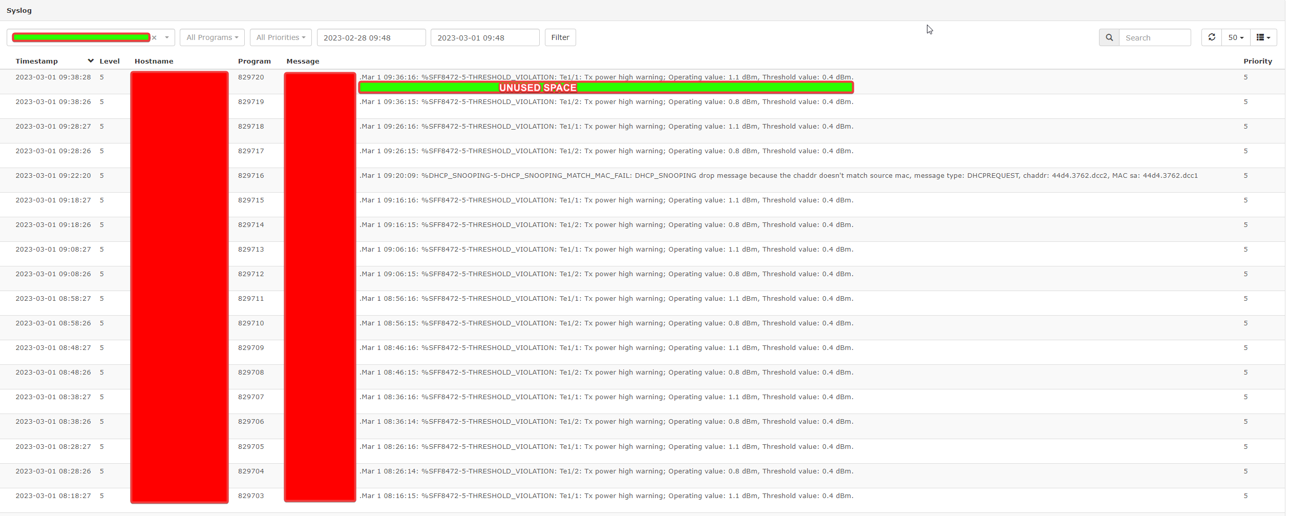
When you look at syslog in librenms with browser on normal(100%) scaling. There is a lot of “unused” space.
We have moved from Cacti to librenms, but the syslog layot is not very “optimised”.
Is there a fix for this? Editting CSS files?
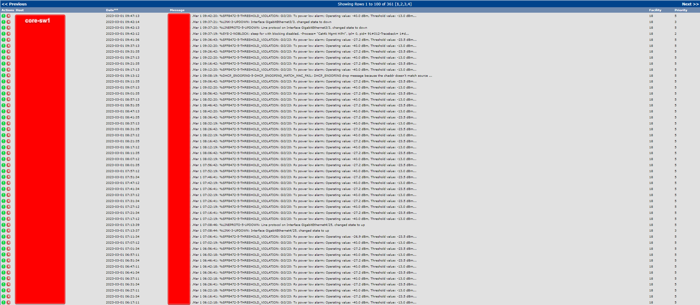
Cacti view(red is hostname). As you can see, the lines are tighter without any space between.
In librenms syslog, it looks like there could be two lines of text in the log window.