When looking at the overall traffic graph for a device such as a router or a switch, the graphs will show the same IN/OUT traffic (as its graphing the ISP eth port “IN” + the uplink to your switch/customers eth port “OUT”)
As opposed to being able to see the BW IN and the BW OUT in a graph. How can i fix this?
(im having troubble phrasing this, but my piont is the Overall traffic graph will almost always look like a mirror image for IN/OUT, which is not very informative. as opposed to being able to see your IN traffic and your OUT traffic, without having to drill down to a graph for a specific eth port)
i think what i want to do is disable graphing for one of the many eth ports on JUST the “overall traffic graph”. Maybe im doing something wrong, bc i cant see how the overall traffic graph would be of use to a majority of ppl if you cant make out IN / OUT (because , as an example on a switch, if eth 1 is taking in traffic, of course eth2 is pushing out that same traffic)
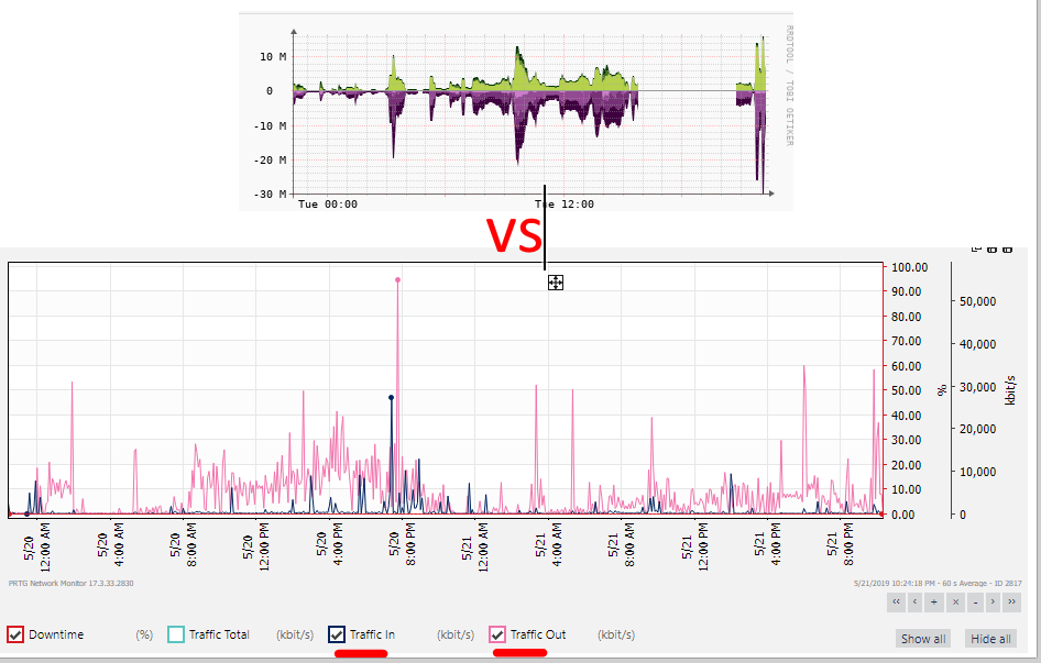
vs (same device, but below is more the graph im looking for on the librenms “overall traffic” graph
thanks