is it possible to create customized graphics on the dashboard? For example, adding PPPoE Session Count of several concentrators in one graph, or adding in a graph the power (DBM) of specific interfaces, I searched and found nothing in the documentation, maybe a graph that I could consult directly in the db?
if it is something which is still graphed you can bring Graph to Dashboard with Widget “Graph”
hope this helps
Yes, but in the case of PPPoE Session Count, I can’t add more than one host so that it aggregates, or even from dbm, I can only aggregate the interfaces of all concentrators, not being able to exclude or limit the necessary inferences.
any ideas for that? or is it not possible? would be the case for implementation?
as i know it’s not possible to merge some Graphs together to a custom one
In zabbix / grafana I can mix traffic from a port with the memory of a server for example, wouldn’t there be a way to create something like that?
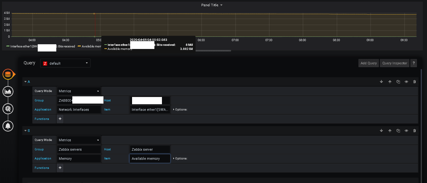
you can use Graphana with LibreNMS, maybe via this way?