Noted the spacing changes on the dashboard presumably from recent Replace Gridster with Gridstack for dashboard widgets by laf · Pull Request #19517 · librenms/librenms · GitHub
I’ve no way currently to propose a proper fix/config option - so here’s my workaround to hopefully inspire someone else, and also solve your issue if you have the same. Not perfect, probably wrong, but a start.
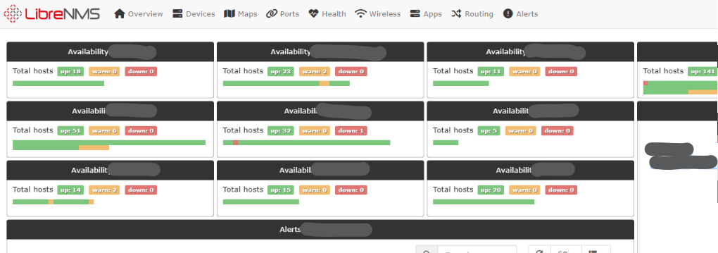
Normally we see this:
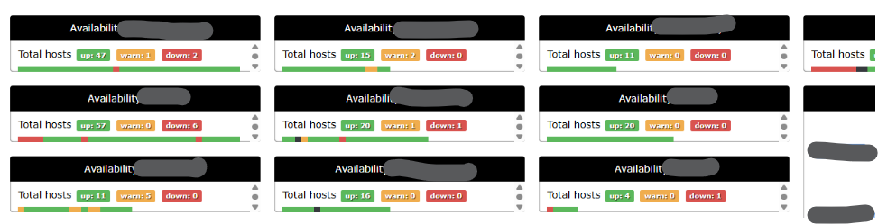
Now we get:
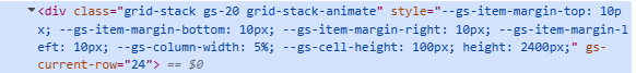
These bits are inline and need to be overridden, I can’t see where/how they are generated:
So I made a custom css file and roped it in, ran daily script again, and it’s all back more or less how it was before.
.grid-stack, .gs20, .grid-stack-animate {
  --gs-item-margin-top: 0px !important;
  --gs-item-margin-bottom: 4px !important;
  --gs-item-margin-right: 4px !important;
  --gs-item-margin-left: 0px !important;
}
lnms config:set webui.custom_css.+ css/custom/styles.css