My progress so far:
reinstalled librenms. left it untouched for a period of time (just added devices). RRD step was too high so i tuned it down to 100 and heartbeat to 200 (network blocked snmp because rrd step was too high). Polling otherwise is ok and works perfectly fine. all equipment go with snmp v2.
Graph are almost the same. still, i’m not really where i want it to be. Can it be that librenms is cutting spikes automatically? still wouldn’t explain the differences between the graphs if i zoom it in. why is it inacurate?
Example:
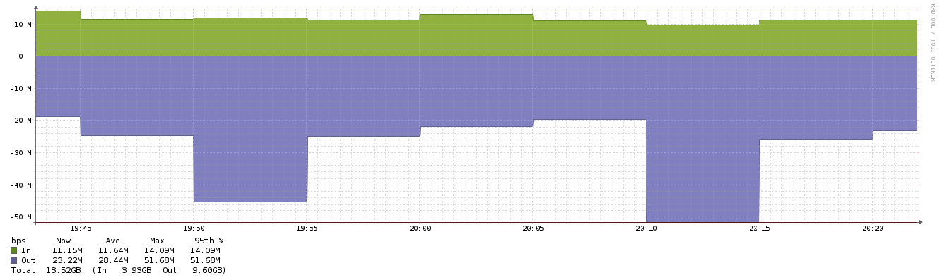
between 20:10 and 20:15 i have in cacti 100mbps and in librenms only 50mbps
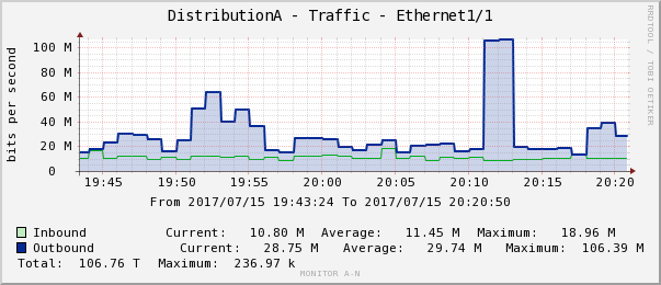
between 19:50 and 19:55 the graph doesn’t look at all the same. the values are also completely different.
Example 2: (past 6 ours)
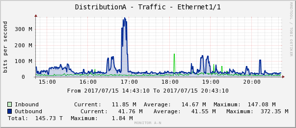
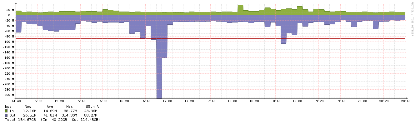
almost the same. a little bit past 18:00 i’m missing the spike where in cacti in goes to 100mbps and in librenms only 20mbps. at 16:45 (behind the 300mbps bar) there should be the graph value higher and not on the average red line.
it’s not very accurate. @murrant can you help me make librenms more accurate in graph?
(btw. this problem is for every device. not only this one)
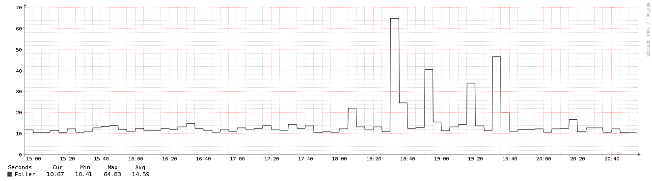
poller in distribution should be around 15sec. so polling is fine i guess.