Hi,
Quick question/suggestion about the port discard graphs.
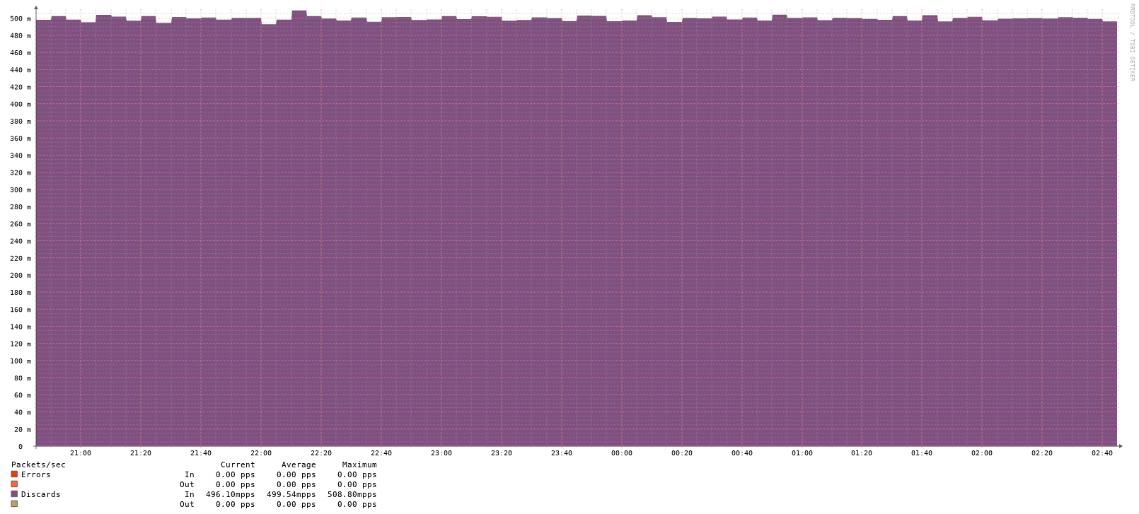
They currently show rates in “mpps” (millipackets per second), so my graph displays “500 mpps” which initially made me think I had a massive problem - but it’s actually just 0.5 packets per second.
I spent a few hours troubleshooting before realizing the unit was milli, not million ![]()
What I’m seeing
LibreNMS graph:
Y-axis: 0, 100, 200, 300, 400, 500
Label: "mpps"
Maximum: ~500 mpps
Actual SNMP data:
bash
$ snmpwalk -v2c -c <community> <device> .1.3.6.1.2.1.2.2.1.13
iso.3.6.1.2.1.2.2.1.13.2 = Counter32: 13525
Verification I did
I polled the SNMP counter twice to verify the rate:
bash
Poll 1 (01:02:23): Counter32: 40747
Poll 2 (01:07:51): Counter32: 40910

Time delta: 328 seconds
Counter delta: 163 packets
Rate: 163 / 328 = 0.497 pps

In millipackets: 0.497 × 1000 = 497 mpps
LibreNMS graph shows ~500 mpps at exactly this time, so the data is correct - it’s just the display that’s confusing.
Suggestion
Would it make sense to display this as “0.5 pps” instead?
Not urgent at all, but would definitely save some confusion for others!
LibreNMS version: 26.1.1 polling from latest rolling vyos