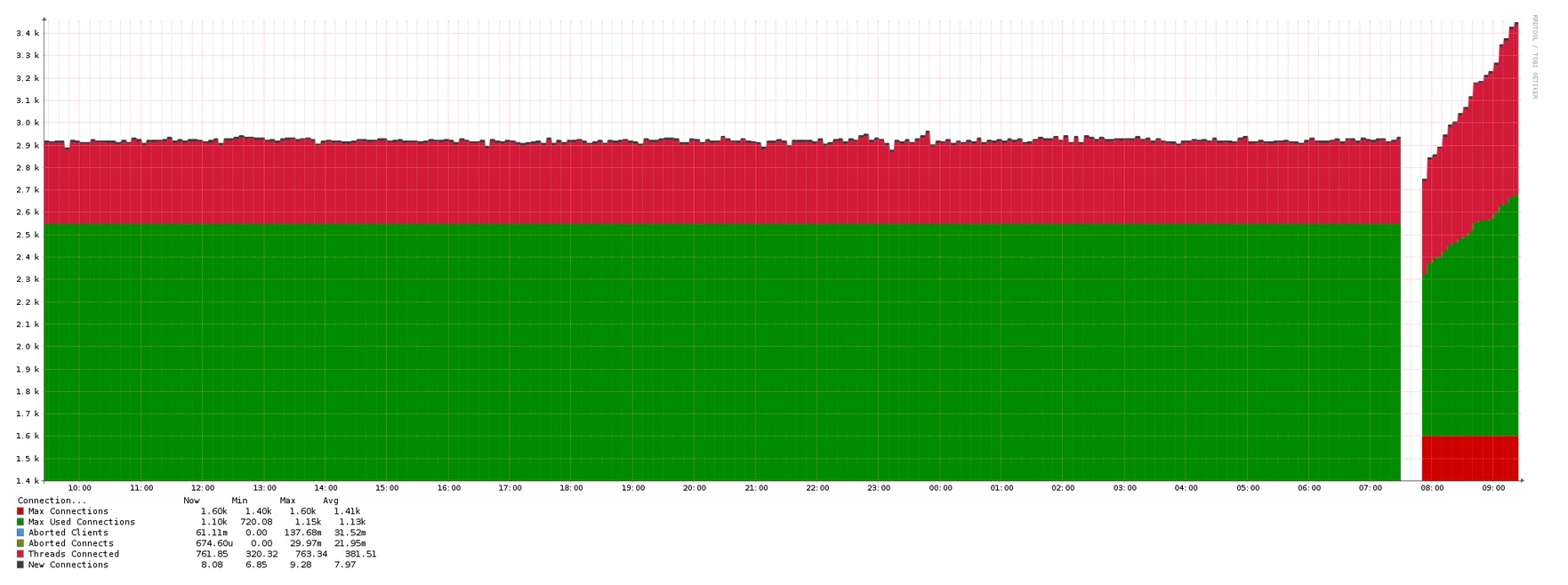
For some of the graphs, they would make more sense to use lines instead of stacked areas to display the data. For instance, on the mysql connections, a glance at the graph gives the impression that there are 3,400 connections in use, yet the max is 1,600. If this was a line graph, it would be much easier to interpret.
Would it be possible to add a switch or check box to switch to line graphs?