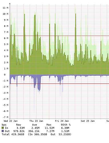
I’m sure this is a dumb question, but… As seen in the attached picture, my interface bandwidth graphs have dark green and purple for traffic in and out respectively. Then there’s much lighter green and purple barely visible in the background. What are these much lighter colors showing? They’re not in the legend.
I think those are supposed to be estimations of traffic.
What is it estimating? Isn’t the darker color the actual traffic?
Shadows are peak traffic
Then what is solid?
Averages.
The now actually means the last 5 min avg.
the avg means the time window avg. (If the graph shows 24h, means the 24h avg)
the max means the max 5min avg of the time window
I understand that. But what are the dark and light colors on the actual graph? Why is there a dark green and a light green? The legend shows only the dark green, so what is the light green?
Ok so the light green is the peak traffic the dark green is the avg
