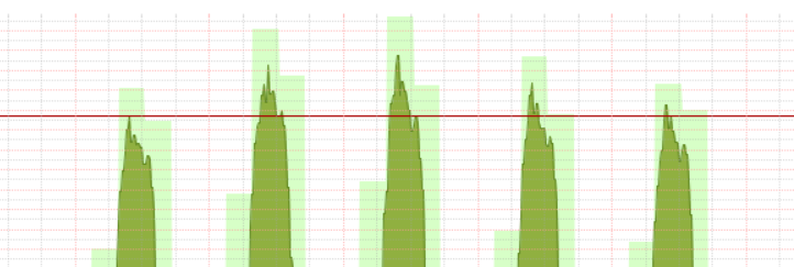
what does the light green shade represent in the bandwith graph. ? i dont see it in the legend. and that red line also
This is a two week view
what does the light green shade represent in the bandwith graph. ? i dont see it in the legend. and that red line also
This is a two week view
As you zoom out you will lose resolution. The light green should represent the peak rate during that period.
Hmm i have my doubts about that. I’ve zoomed in to a24 hr. if it was the peak why not just increase the dark green part ???
I think thats estimation
would a legend icon under the map be good thing to add to these maps so its apparent what that is.
Yeah code changes are welcomed. 
According to my legend
the light shade is the Max value seen, and the dark colour is the Average,
and the Red line is 95th percentile of the overall view.
Correct, @Chas !