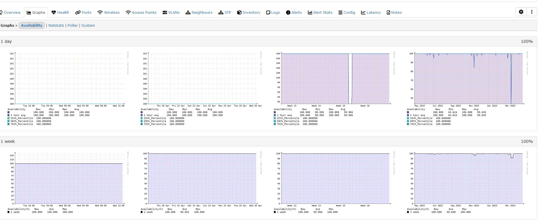
I’m seeing strange output on the Availability tab of all devices. The first two graphs are blanks.
Also, instead of showing 4 x 1 day graphs, in the 1 day section, it shows day, week, month and 6 month graphs.
Does anyone know what’s going on? Thanks very much in advance for your help.
Also, thanks to everyone in the LibreNMS community for contributing to such an awesome application!
Brilliant! Thanks so much. The graphs all display correctly now.
The issue re: labelling remains though, ie - instead of showing 4 x 1 day graphs, in the 1 day section, it shows day, week, month and 6 month graphs.
The 1 week, 1 month and 1 year sections show the same data, but apparently with different time period used for the averaging. If this is the case, Please can the section headings be changed to clarify, because “1 day”, “1 week”, “1 month” and “1 year” doesn’t explain the data being presented.