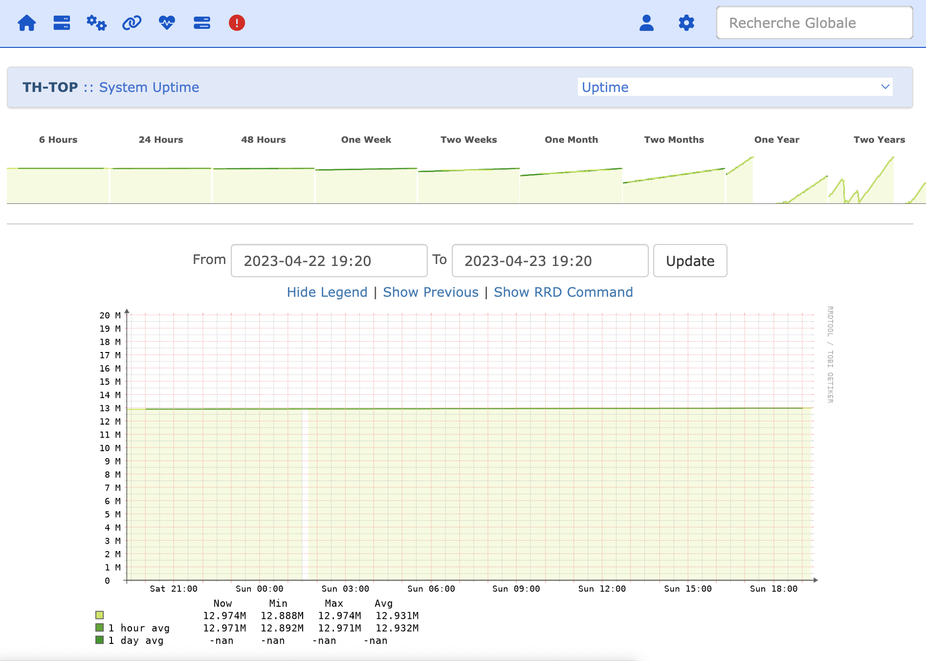
Since the 23.4 update of LibreNMS, I’ve noticed that the “system uptime” graph scale on the y-axis has become strange.
Before, I could immediately tell how many days the system had been up,
but now the scale on the y-axis is in millions of something!
Is this normal? Is it possible to revert to a scale in days?
I have exactly the same issue - the uptime graph on Y axis suddenly shows only number of seconds of uptime and does not recalculate this to minutes/hours/days/…
Other graphs works fine, uptime is shown correctly at device overview and system has no other obvious issues.