Can someone please explain why utilization graphs have a solid and a semi-transparent coloring? What distinguishes them from each other? See attached screenshot:
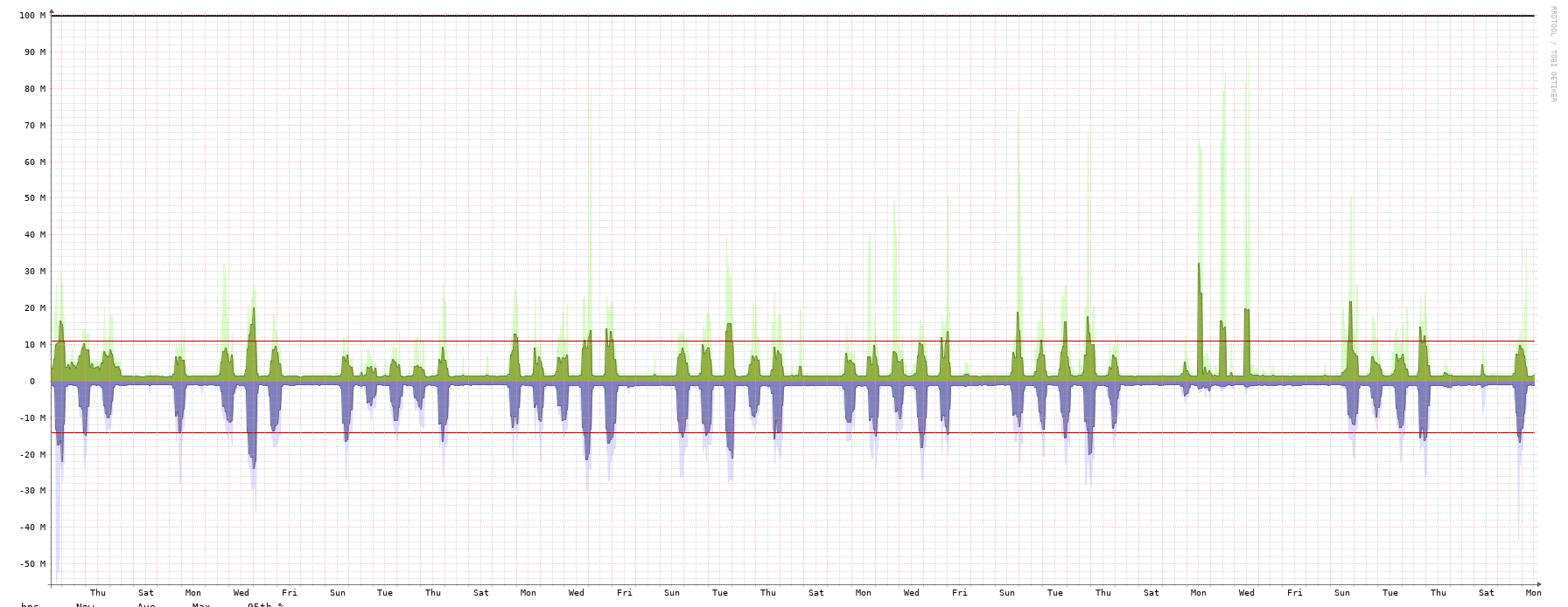
Check the “Show RRD Command” command link to be sure, but I believe on that particular graph you’re seeing average bps in the dark colour and max bps in the light colour.
In the RRD command you’ll see these as DEF parameters (most of the CDEF and VDEF parameters are used to calculate the values for the legend table).
Example:
DEF:outoctets=device_name/port-id.rrd:OUTOCTETS:AVERAGE
DEF:inoctets=device_name/port-id.rrd:INOCTETS:AVERAGE
DEF:outoctets_max=device_name/port-id.rrd:OUTOCTETS:MAX
DEF:inoctets_max=device_name/port-id.rrd:INOCTETS:MAX
Basically, the LibreNMS poller polls your device at some interval (5min by default). Once you view a graph with a large enough timeframe that RRD can no longer fit each 5min data point on to the graph, it starts to group those 5min data point together into consolidated data points.
If RRD calculates that it needs to group your 5min data points into a series of 30min consolidated data points to fit it all on a graph, then you can kind of see how the average vs. max data works.
Underlying 5min data points = (1,5,9,9,5,1)
Resulting 30min AVERAGE consolidated data point = 5
Resulting 30min MAX consolidated data point = 9
1 Like
This topic was automatically closed 7 days after the last reply. New replies are no longer allowed.