Hi,
Looking at the columns of the port detail list, all values apart from Errors are listed in per second format.
In order to standardize this, we should adjust this to be in errors per second format.
This has the added advantage of getting around some issues with snmp standard itself, where snmp counters cannot be reset until a device reboot.
Currently when fixing a bad interface and sorting by errors, the previously bad interface is still filtered to the top. This can cause confusion on if there are still issues with an interface or not.
Changing this to a PPS value would be an instant way to sort by interfaces that are currently having issues.
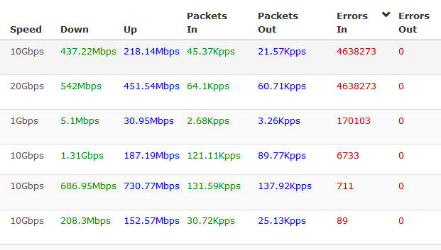
https://librenms/ports/format=list_detail/
2 Likes
I requested some direction to address a couple of years ago that the graph just shows the “delta” metric and while some people liked the post, no one even answered my question, which I thought was a pretty easy question at the time.
I think using the delta would solve the SNMP issue in that you aren’t looking at the history of errors on a particular interface, just the amount of errors seen in the last polling period. It honestly seems like a simple fix of just adding a couple of columns for the error delta (in/out), but I guess it’s either more complicated than it appears or very few people have an issue with it.
I do agree it’s helpful to have the total errors of the interface displayed. I like being able to see it’s an interface with a history of low or high interfaces on the initial list as a way to prioritize the entries on the list. The one that saw 100 errors in the delta but has less than a thousand in the past month isn’t as big a deal as the one that has a dozen errors in the delta but seen 100,000 errors in the past month.
However, I don’t think displaying “errors per second” is particularly helpful. Anything less than 300 errors in one 5 minute polling period will show up as less than 1 error per second, which confuses and annoys many people. At least in a graph the spikes can convey the problem in a visual context, that raw numbers can’t quite convey… but it’s hard for anyone to prioritize 6 errors per microsecond.
2 Likes